SNGK plant corporate identity
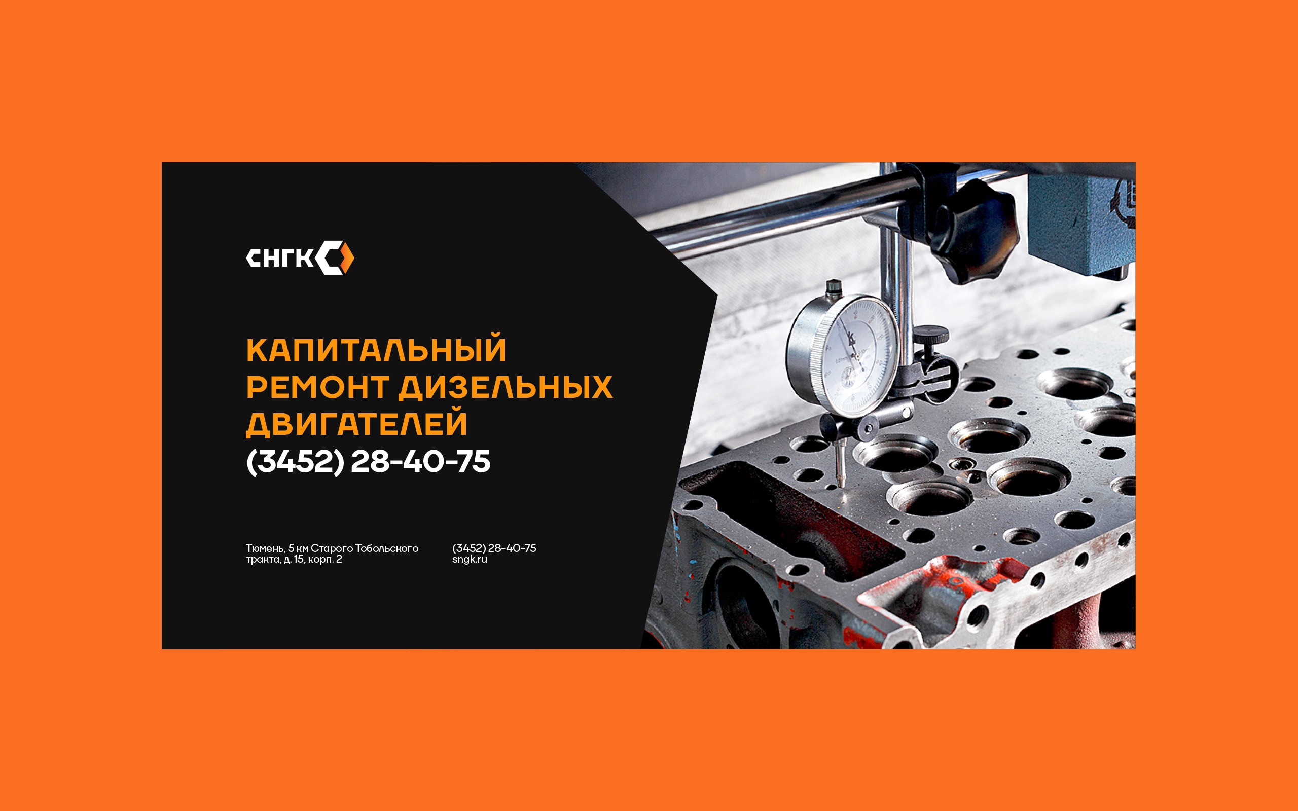
The SNGK plant has more than 15 years of experience in SKD and overhaul of machinery. It has its own production plant for engine repair and restoration.
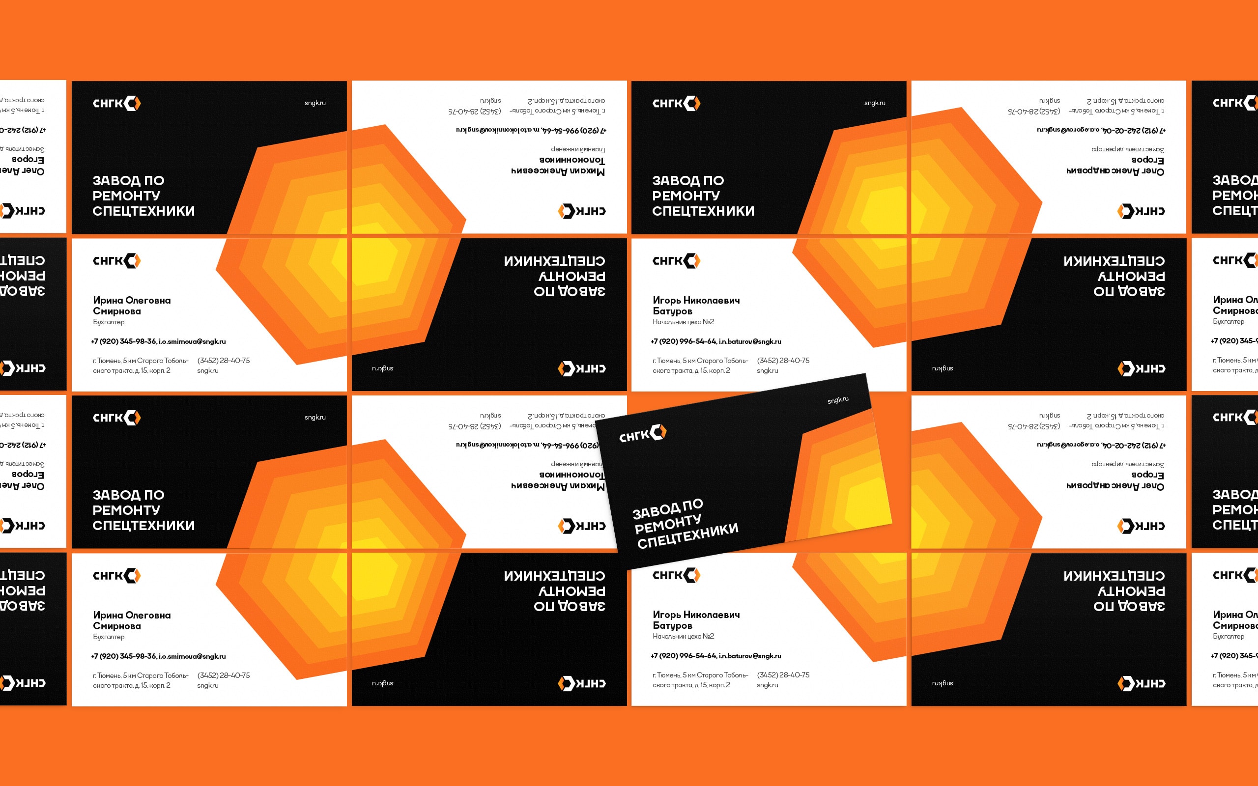
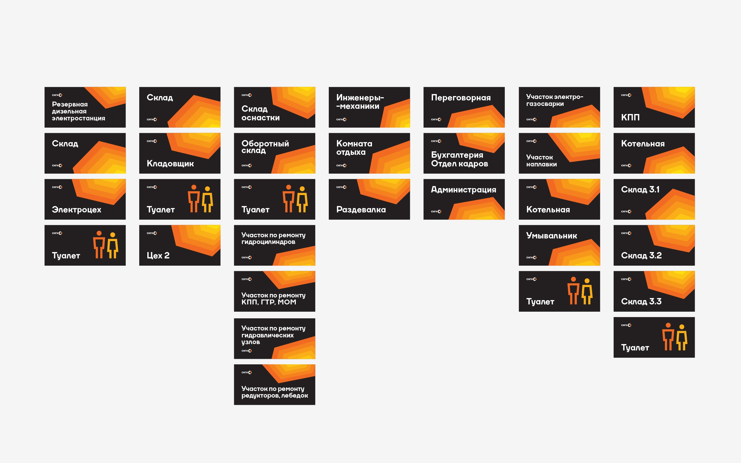
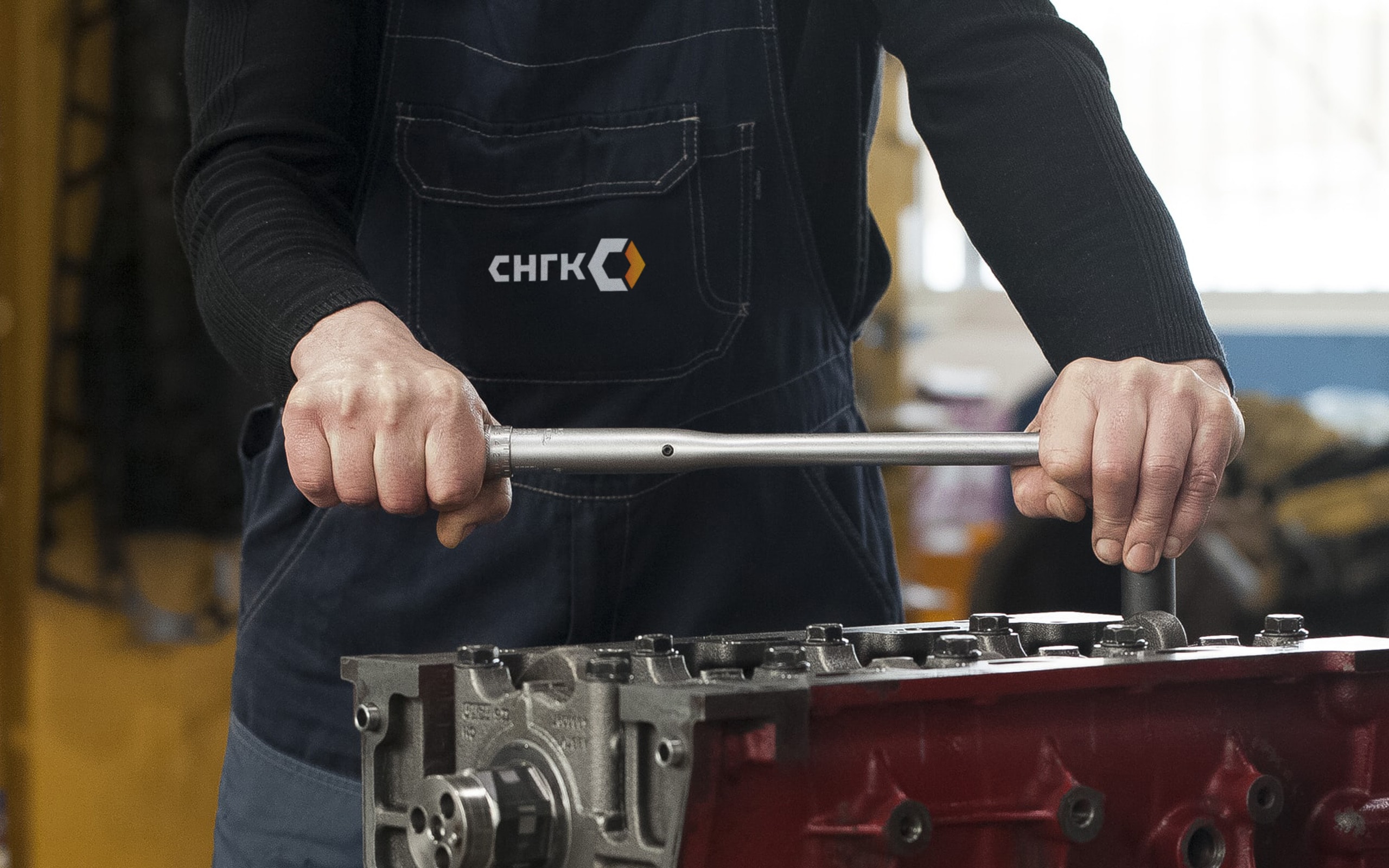
The logo design is based on the shape of a hexagonal wrench. This shape has been integrated both in the first letter of the company’s name and in the corporate logomark. The logomark further features an orange arrow, which symbolizes progressive movement and development.
Concentric hexagons are the basis of the corporate graphics. The shapes call to mind nuts and driveshafts and also create depth.