O!Doner corporate identity
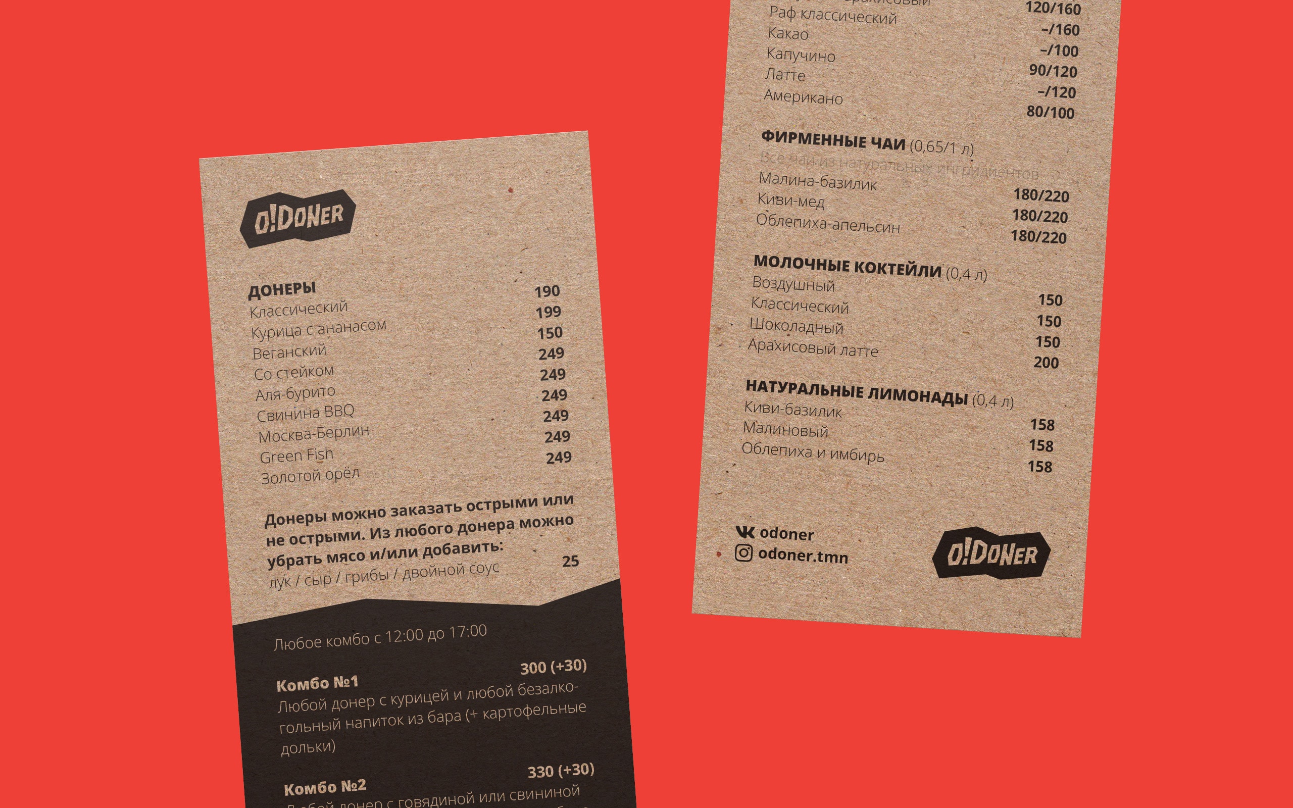
O!Doner is the first doner bar in Tyumen, Russia. It offers a varied menu, featuring a wide range of flavors and combinations.
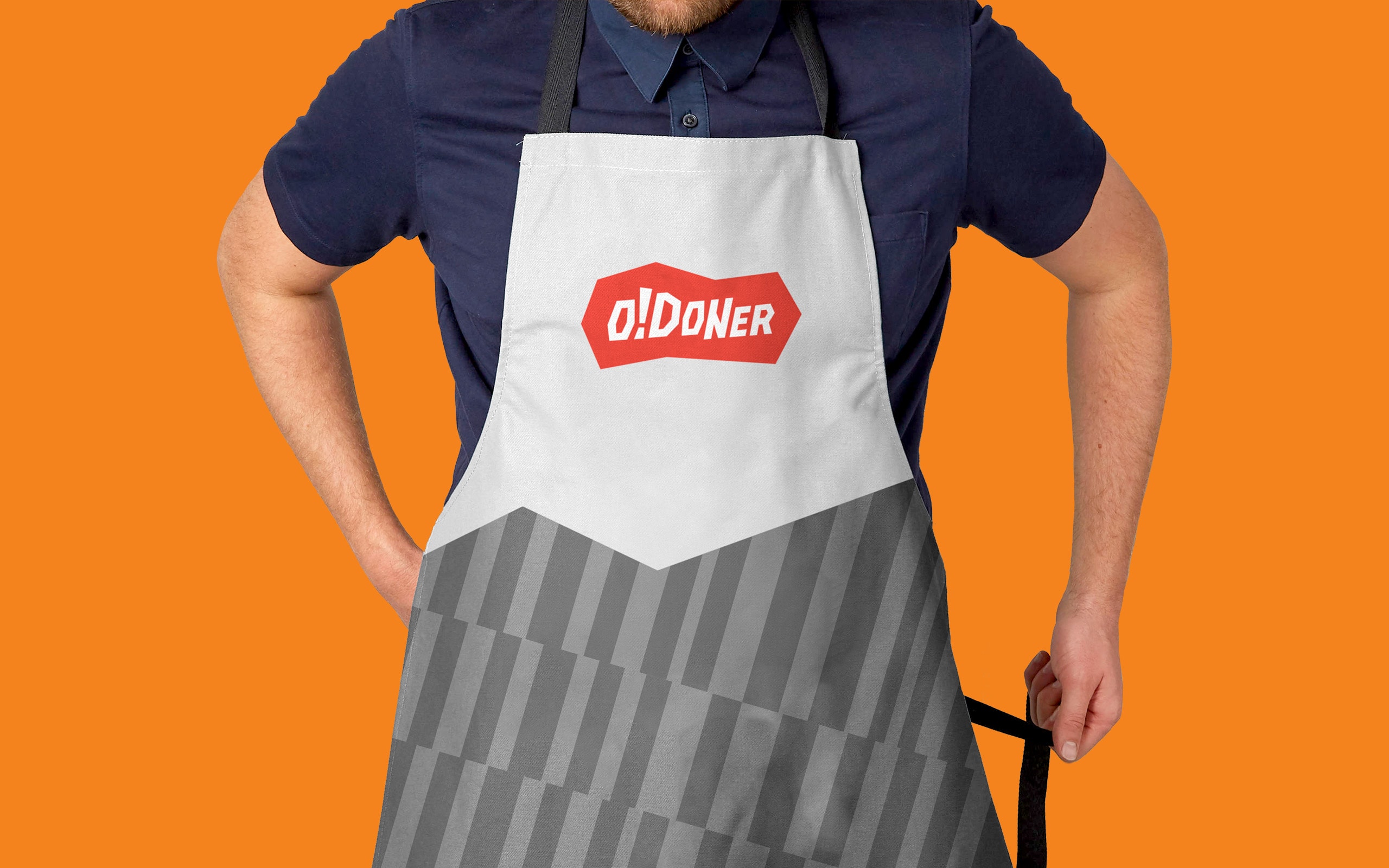
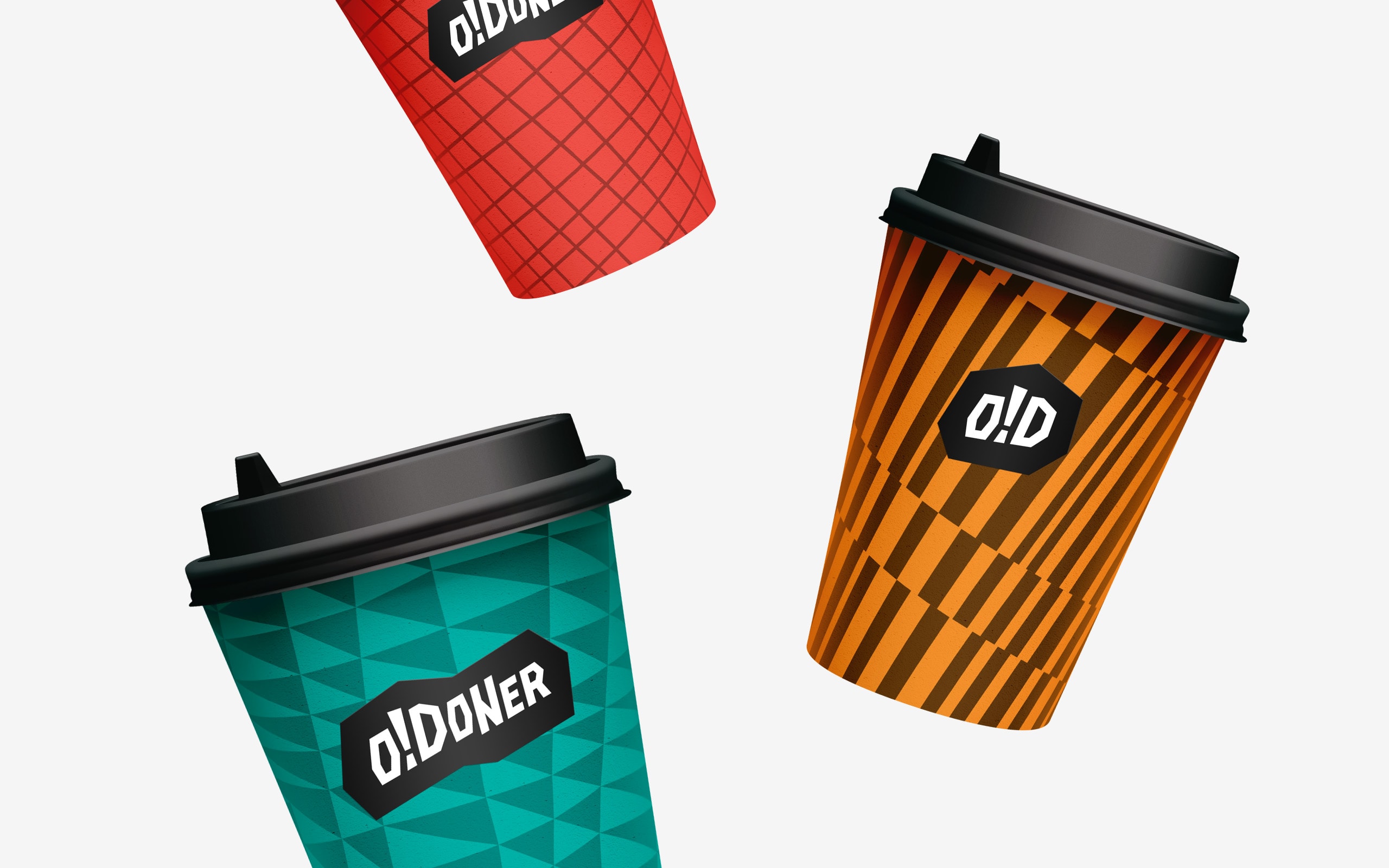
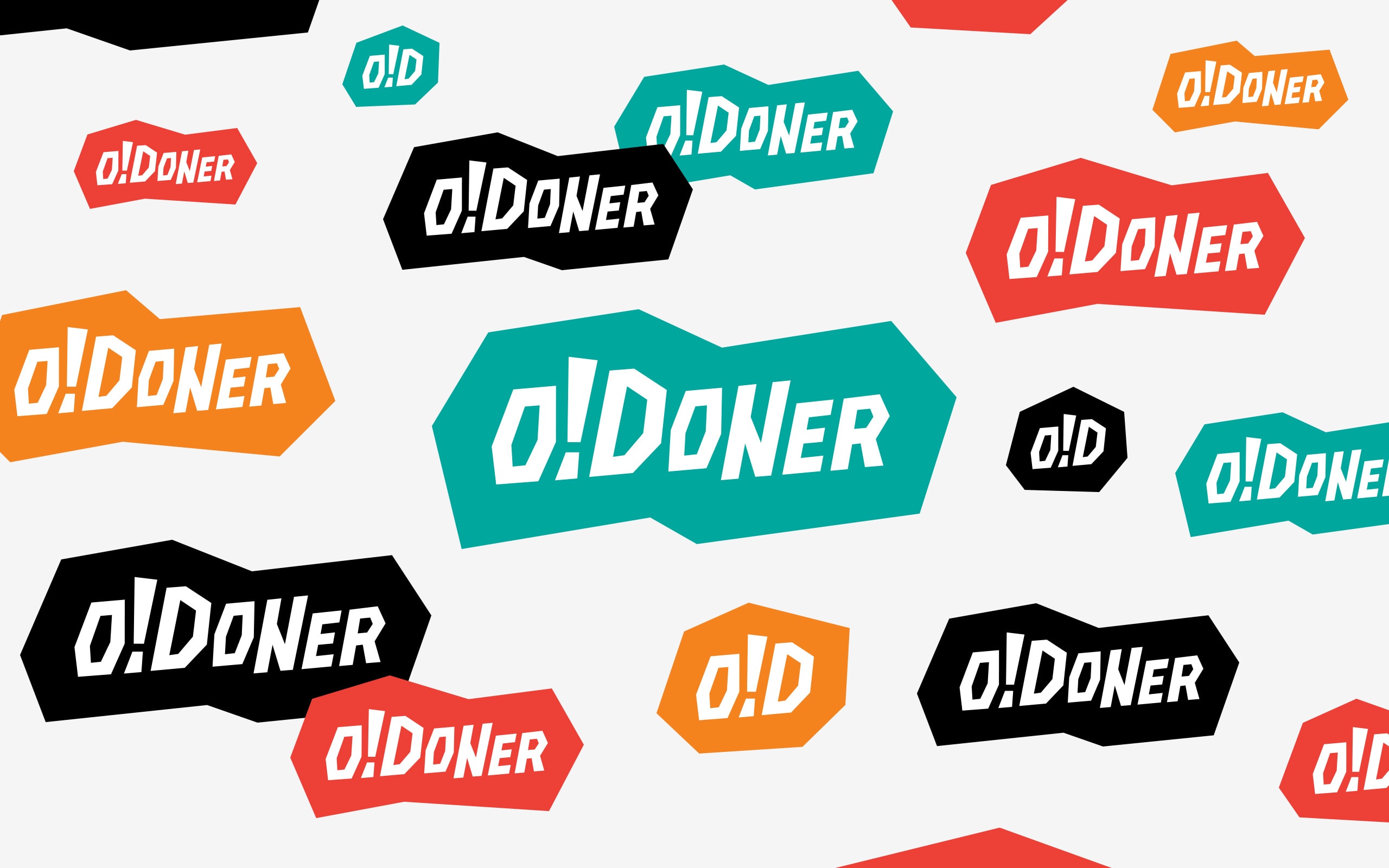
The chopped, broken shapes in the logo emulate shavings of meat sliced from the vertical spit emblematic of doner restaurants, as well as the paper in which the food is served.


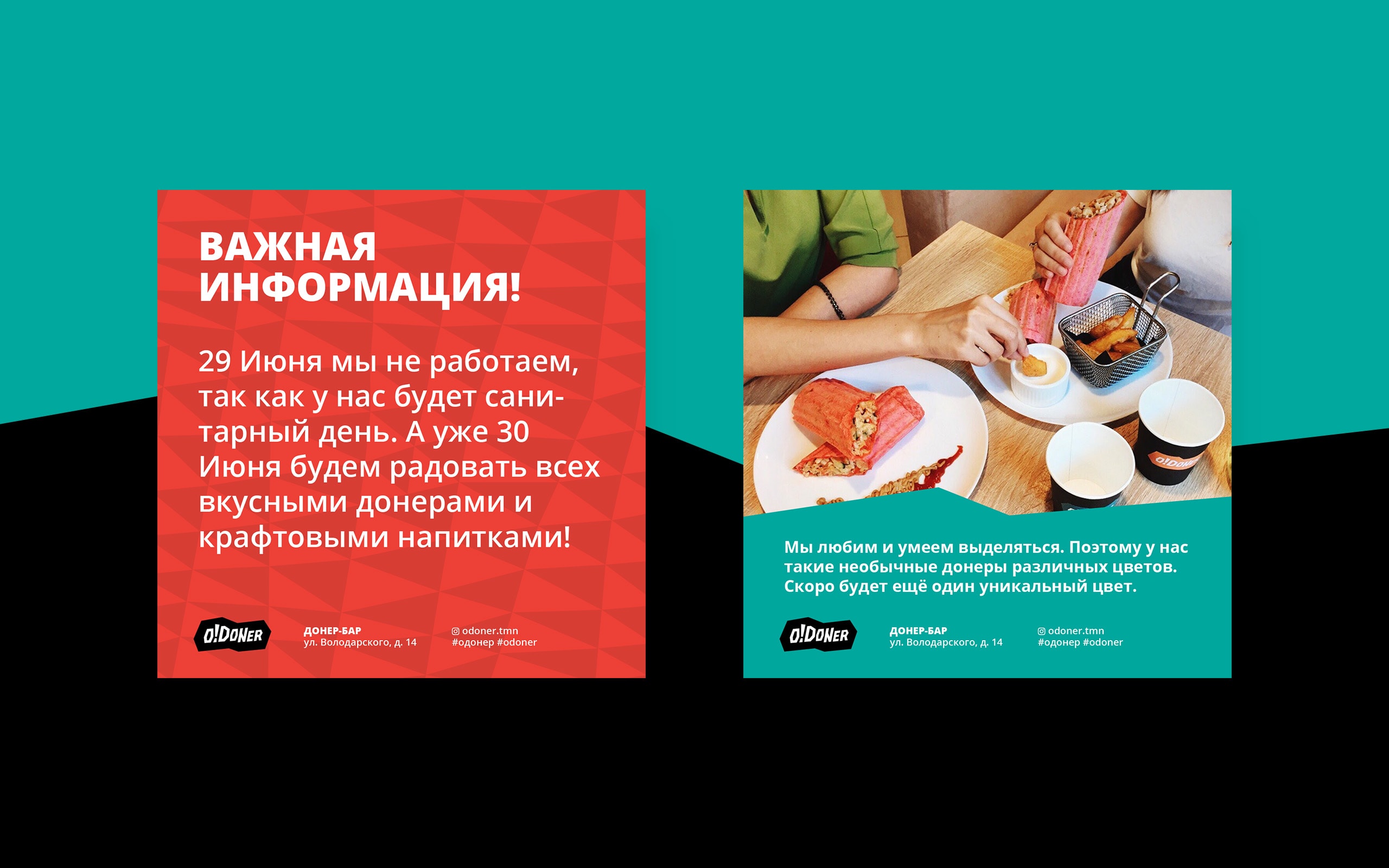
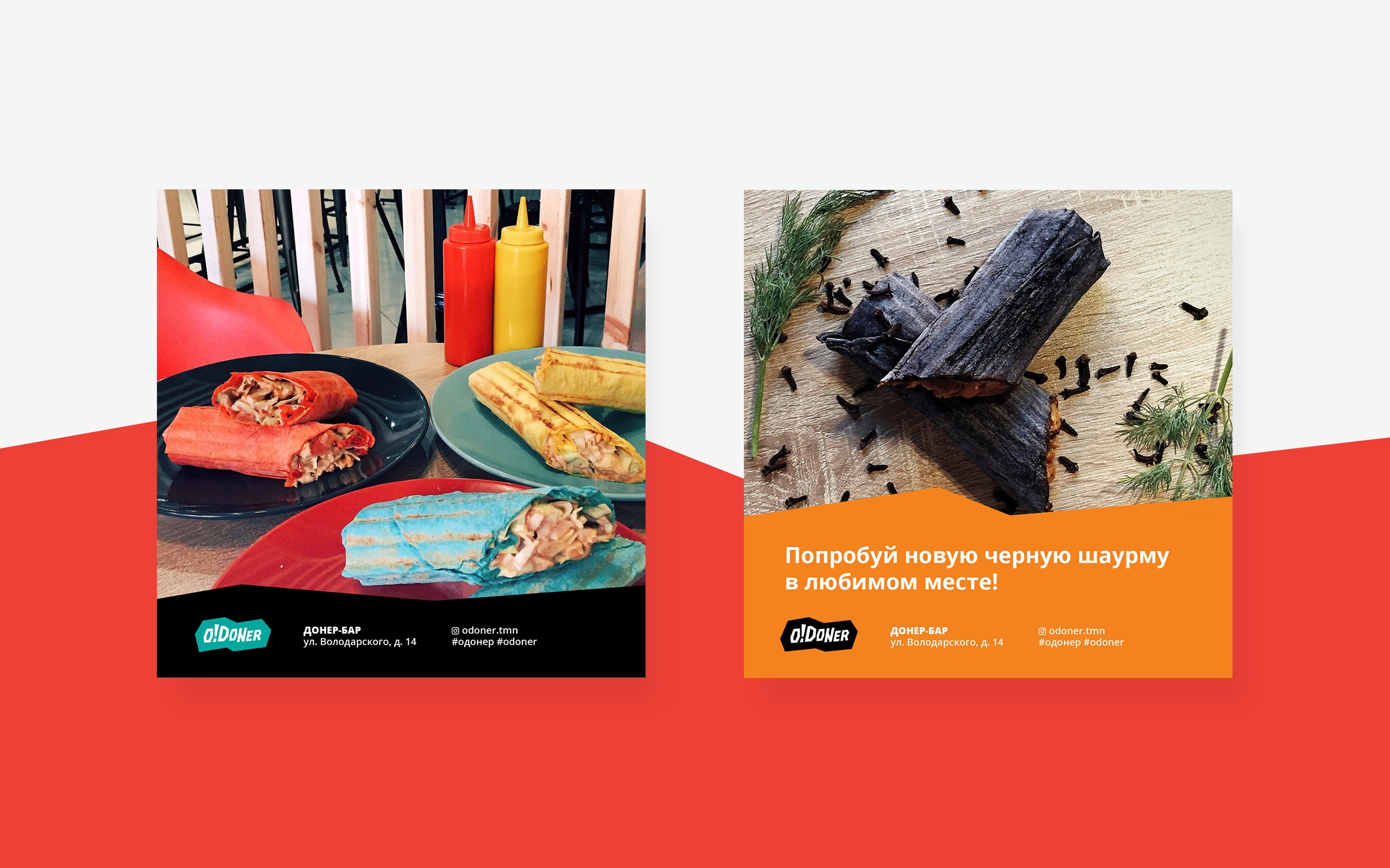
We designed geometric patterns and graphics that can be used anywhere, including chef’s aprons, paper cups and social media advertisements.